Accounting image updated
Le Cornu Lewis Hancock provides quality personalised financial services to family owned businesses. They are a traditional accounting firm. One of the founding partners from Le Cornu Lewis Hancock approached us to update their brand identity. Needing to convince other partners of the branding issues, we met with them to pitch for the work. They came on board and wanted to refresh their existing identity.
Challenge
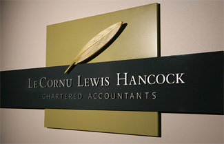
The new brand needed to demonstrate the expertise and quality of the company, something that the existing maroon coloured quill was not achieving. However in a client meeting, one partner mentioned to a client that they were updating their identity and the client stated “I hope you don’t get rid of the quill.”
Solution
Keeping the quill and loosing the maroon was the start. We took some inspiration from the partners themselves; in one meeting someone was wearing a black shirt with a gold pen in the pocket. This colour combination was striking and when combined with white became the brand’s new colours. Black and white aptly represents this profession. The quill has been simplified and gilded, communicating quality. Applied to building signage and all stationary the next step was a website.
We have created an easy to navigate website that provides just the essential information about Le Cornu Lewis and Hancock. The symbols of chess are used to show skill strategy and thought. The limited colour palette again communicates quality. Black and white photographic images of the team members show personality avoiding the dry accountant image. Copy on the site has been written to be inviting, warm and personal.
Results
- Brand has been modernised yet still holds traditional values
- Improved company image with brand fitting quality of services offered
- Office signage creates the right first impression
- Website improves communication