How Optus 'Spoiled' the World Cup (And what it can teach us about user experience)

9:00PM - Russia: A hotly anticipated World Cup quarter-final clash kicks off in front of 40,000 fans. Millions more are watching live around the world. My team hasn't been at this stage of the tournament in decades.
at that same moment...
3:30AM - Australia: Cozy in the knowledge that the replay will be available to stream later, I'm sound asleep.
6:00AM - Australia: My alarm jolts me awake. I get up and start to ready for work, eager to watch the replay over breakfast.
I leave my phone on airplane mode, face down. No alerts, no notifications, no group chat updates. Scoreline lockdown.

6:15AM - Australia: I settle in with my muesli and OJ. Flip open my laptop and fire up the Optus Sport App to watch the game. I'm bristling with anticipation for the stream replay to… oh.

(There's something else wrong here.. but we'll need another article (Photo by @shenghshi))
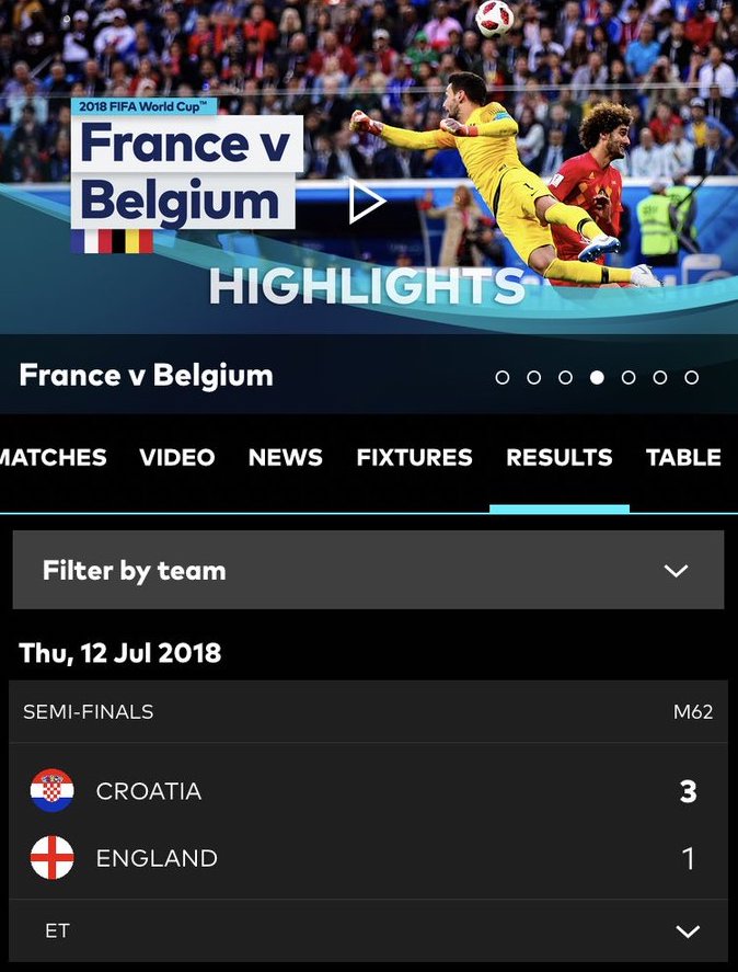
The semi-final fixture shows the opposing team's name. I can't unsee this. World Cup over. 😞
Spoiler alert
Of all the broadcast issues Optus had during this World Cup, this might be the one that hurts fans the most. It shows that Optus fails to understand the mindset of its audience.
Most fan groups accessing content services are hungry for a leaked picture, teased trailer or breaking news about their interest. In a flip of that script, Optus broke the trust of an audience that does NOT want to know the latest updates.
Soccer fans (and I speak from first-hand, seasoned experience) want to get up to close to the game in two ways. We're keen to get instant alerts on transfer news, fixture-lists and third-kit reveals. In contrast, there's the match-day broadcast. That's on our terms. We'd rather experience the joy, passion and sorrow in our version of 'real-time', even if it's hours after the final whistle. This is especially true when a World Cup takes place in a timezone where most games are broadcast in Australia overnight. For a streaming provider, this detail is crucial.
When user experience is too effective
There is a perception (backed with a lot of evidence) that by removing effort we can improve a user's experience. Optus Sport's app favours this approach. It's simple to scroll or tap to get to a match. But wait. The use-case 'Make it easy to watch a match' isn't contextualised with when or how. Here's three simple ways that 'easy' broke the result too early:
The homescreen favours upcoming over the past
Imagine if you saw your favourite show's main character in a situation that hasn't happened yet, but you suspected it might. The mind races with plotline scenarios. Ardent fans will know potential World Cup fixture permutations for their team if they beat the current opponent. At the top of the Optus Sport homescreen feed are upcoming games which you have to scroll past to find the match replays. Next round fixtures (which may or may not contain your team) displayed ahead of last night's game. Result spoiled.
Extend highlights retell a story
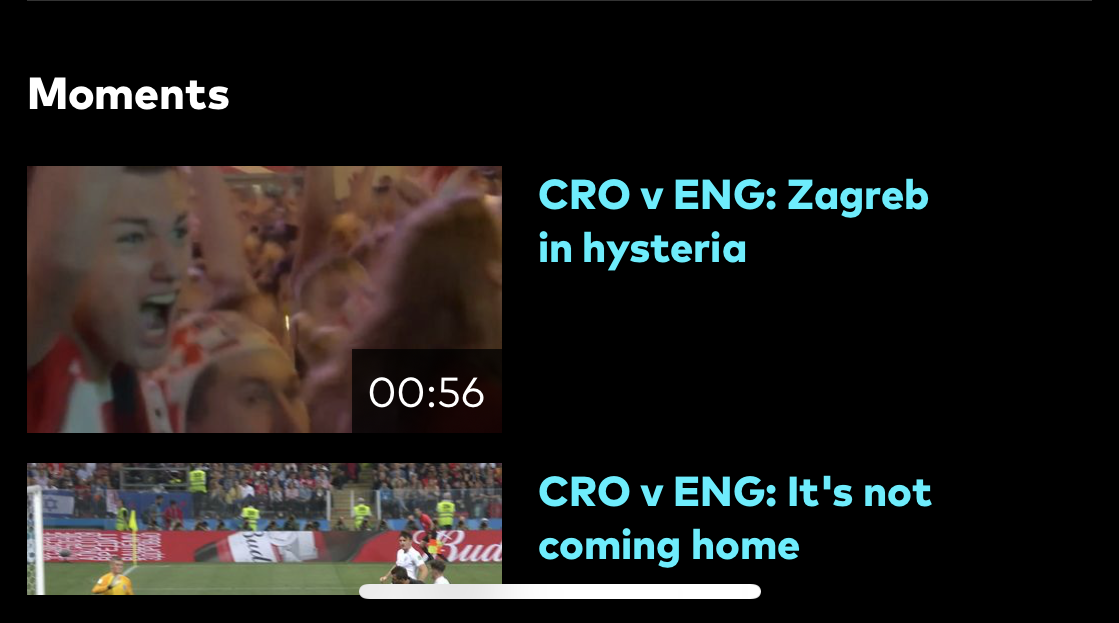
Short on time but big on expectation, a highlights reel is a snack-size match. The final score shows at the end of the package. The same rule applies here - fans (and the match commentator) uncover the result (and related emotions) as they go. Optus Sport's extended highlights offered a different take - a studio-based narrator recounting the game to us over the action. Match-day context was also provided, which made it tricky to cue-up other videos without knowing their results too. The format revealed the outcome within the first 30 seconds in each video. Result spoiled.

(A moment you can't forget)
Useful visual elements reveal too much
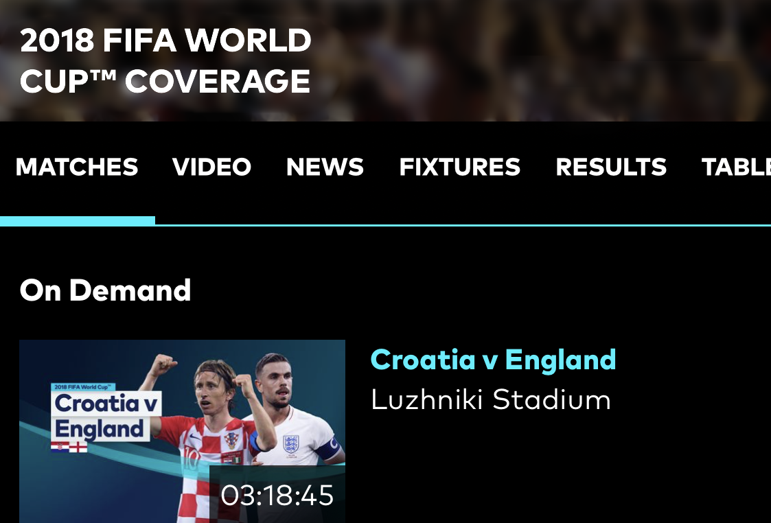
Timestamps have become a part of online-video vernacular. We glance at the seconds left in a pre-roll and revel in a few minutes worth of must-see teaser trailers. A soccer match with pre-, half-time and post-match discussion clocks up at a couple of hours. When Optus Sport shows a timestamp that runs for three and a half hours… that equals extra time and a penalty shoot-out. Result spoiled (The normal 90 minutes are moot - you know you're in for a rough ride to the last kick of the game).

(Looks like we're heading for extra time)
Personalisation from polarity
It's crushing to have jinked and feinted past spoiler notifications from peers only to have your match-stream provider put in an own goal. Away from the app Optus have been quick to rework how they show content through subscriber updates. User feedback forced this change. Before, email subject headers had given clues to last night's action.
By looking at the spectrum of audience behaviour we can find a solution to the 'spoiler' issue. Scroll through the hundreds of comments on Optus Sport's social feeds and the key insight is plain to see. 'DON'T TELL ME THE SCORE.' While it seems contrary to instant-gratification, this extreme user is trying to tell us something important.
We can take this extremity and build a basic personalisation profile around it. The use-case may be 'always hide the score unless I give permission'. As a filter for the in-app experience it's eye-opening. Tiny cues and interaction nuances become major signposts for the game result.
What's most frustrating is that these issues are easy to fix.
Personalisation provides us with a double opportunity: a deeper relationship with the user and a demonstration of knowing the game. To do this, personalising the content delivery would need to be counter-intuitive: don't show me what I most want to know.
The key to effective personalisation is combining traits of users, rather than a single aspect of behaviour. For Optus Sport - location, time, previous session behaviour and team preference are essential. Imagine this scenario, all using data that the app has access to:
- On downloading or updating the app ask a user to nominate their preferred national team (this happens already happens at a league level).
- On opening the app capture the user's location (country or timezone), confirm this against subsequent opens.
- On using the app, aggregate session behaviour - the videos a user views, and the time of day they do so. Now we have data on their user behaviour and preferences. Use this to create a hunch - they might be a 'morning after the match' viewer.
- In return, offer a toggle switch: 'Keep my team's results hidden from me'. The ability to curate their own viewing preferences. Content is re-ordered or displays in a different manner to an un-curated view.
An easy way to build trust with an audience is by showing you know what it's like to be in their shoes. The toggle feature is one proof-point of this.
User experience considerations are there to make tasks simple for us to perform, to an extent. We must also give consideration to the habits and rituals in which users contextualise an experience. This forces a richer insight by asking: 'What are user behaviours actually revealing about people?'
The Optus Sport app experience shows us that we must understand where the extremities of users lie. These ends can highlight dissonance to us that we must learn from and build for. We can see how soccer fans behave compared to other digital content consumers. Twist user interface conventions to meet their needs. Know the code.

If we don't know what the outliers want, we should ask for their help. Gather feedback, then synthesise meaning from it. A vocal fan group may be our best ally for building a great user experience - they'll roar in unison if it isn't.
After the game is before the game
Sepp Herberger, 1954 WEST GERMAN WORLD CUP COACH
In the end, whoever streams to us is a facilitator framing what we’re most interested in - the match. The frame should enhance our viewing experience.
If that means keeping from me what I most desire as an irrational, passionate fan, then so be it.


